Your account on a phone
The account area speaks the same language as the editor: three buttons at the bottom and slide-up panels. Only their roles change — instead of "Add / Menu / Settings" it is "Section / Menu / Details".
The three account buttons
| Button | What it opens |
|---|---|
| Section | The list of account sections — the left column on a computer. |
| Menu | The logo, your account and the links to the editor and the admin area. |
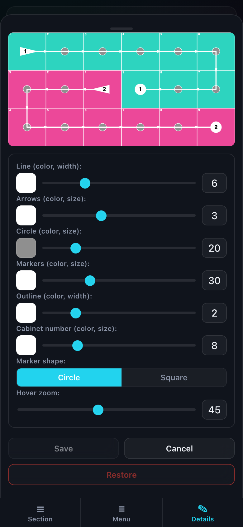
| Details | The form of the selected record: a project, a piece of equipment, a link, a layer. |
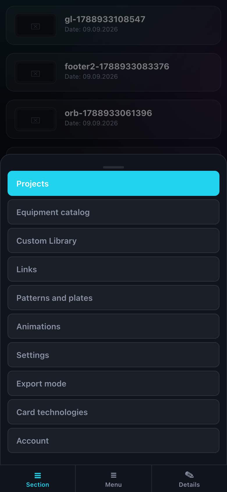
On a section that has no form on the right, the "Details" button does not disappear — it dims. The row stays a row of three: a vanishing button would redraw the bar and read as a change of screen.
Opening a record
The middle of the page is a list of cards. Tapping a card opens the "Details" panel with its form: the panel slides up by itself, you do not need to press the button.
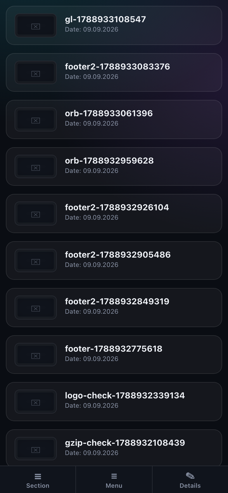
- Tap Section and pick one — "Projects", for example.
- Tap a card in the list — the "Details" panel slides up with the form.
- Edit it and press Save — the panel closes itself.
Forms without a card open the same way: the "Add equipment" button shows the panel with an empty form right away, and in "Settings" the panel is opened by the "Edit" buttons and the display-kind switch.
How it differs from the desktop
- The page scrolls as a whole rather than by columns: on a narrow screen it is one list from top to bottom.
- Cards are rebuilt for the width — previews are smaller and a long name wraps to a second line instead of being cut with an ellipsis.
- Admin tables stay tables and scroll sideways: turning them into cards would lose the row-by-row comparison they exist for.
What lives in each section is covered in the "Your account" articles. This one is only about navigating a narrow screen.